I am not usually someone who gets emotionally worked up over an app icon.
And yet, here we are.
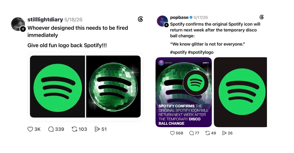
When Spotify updated its look, the internet had plenty to say, and honestly, I agreed with a lot of it. When I first saw the icon, I thought the app was still downloading. That is not exactly the reaction a brand wants from users who interact with it every day.
I had a similar reaction with Google apps. I found myself getting increasingly annoyed because I could not quickly find the tools I use constantly, like Gmail, Drive, Calendar, and Docs, on my phone or in my browser. I knew they were there. I knew the logos. But the visual shortcuts my brain relied on were not working the way they used to.
That is the thing about brand changes. They can look small on paper, but they do not feel small to the people using them. Did you notice when these icons changed?! I was losing my mind!
Here are the new icons if you haven’t seen them already:
Every time someone interacts with your business, they are building a relationship with how you show up. Your colors, fonts, logo, layout, tone, and overall look all become part of how people recognize you. When those elements change too quickly or without a clear purpose, it creates friction.
People do notice. Sometimes they notice because the change feels fresh and intentional. Other times, they notice because they cannot find the app they use every morning or because a familiar logo suddenly looks like a glitch.
Consumers build muscle memory around visuals. They know what to look for, where to click, and how something should feel. When a brand moves too far from that familiarity, even with good intentions, it can make the experience feel less intuitive.
Now this does not mean brands should never evolve. They should, of course. Good brands grow, modernize, and adjust as their audiences, services, and goals change, but there is a difference between changing and improving and causing confusion.
A strong brand should feel consistent enough to be recognized and flexible enough to grow. Your website, social media, email marketing, event materials, ads, and printed pieces should all feel like they come from the same place. They do not need to look identical, but they should feel connected.
That is where many organizations get stuck. They create one version of their brand for the website, another for social media, another for event signage, and another for donor or client communications. Over time, the brand starts to feel scattered. This is no good.
If your audience sees five different versions of your organization, they have to work harder to understand who you are. In a crowded market, making people work harder is a risk.
At K2 & Company, we think about branding as more than a logo. It is the system that helps people recognize, understand, and trust your organization. The goal is not to make everything look overly polished or identical. The goal is to create a clear and consistent presence that still has personality.
Your brand should not make people stop and wonder if they are in the right place. They should know exactly where they are!
-Allison Housley, Account Executive

